Minimalism is such a strange thing, which you recently feel a surfeit. The seemingly absurd - since minimalism is how can it be too much. And yet. Examples of when it works and when it is a mistake.
Durexy . Others do not use condoms anyway. These look good, such a yellow trimmed - for heaven have such a positive value in relation to the original does not. But ok, durexy minimalist version is cool - as long as the content of this trend is not touched ...

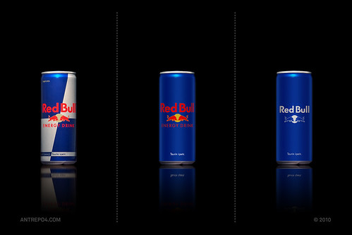
Red Bull. It is hard to say, each version is interesting. Here, minimalism played effectively, as it increased the visual surface of the can. And it translates to a conviction in respect of quantity of content. Well played.
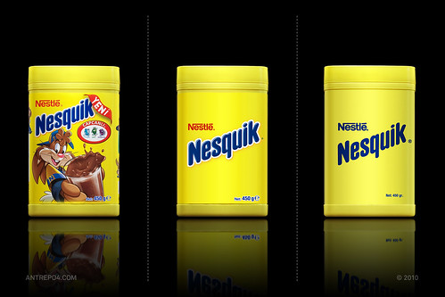
Nesquik. Very nice. The middle is a bunch, but version 3 really successful. And the company and product names sufficient. The rabbit is superfluous. Only that will play for the children. It's hard to say. But you can certainly try to do some research.
Nutella. Moderately successful. The packaging is so ugly that this printed Cover distract attention from him. In the latest version of reminds me of the pack with content designed for stool examination.

Mr. Muscle. Beautiful. Perhaps the best example of how minimalism can improve the packaging and when I play best. Same color gives the space of such perennial classics. Only worries me is that the shelf may lose their magic by the lack of a black background. In the picture looks pretty. I shows an interesting content, giving it a modern, technological, some sci-fi sound. But here works very well. Space technology for your windows. Good climate. Totally better than the old, terrible, babciowej, przegadanej stickers.

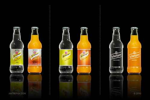
Schweppes. The same story as with Mr. Muscle, so that will look good regardless of the background and place of exposure. And a great message - not hiding our product into over-packaging odciągającym sight, while we are strong enough brand that just our name and nothing more. Beautiful. I think about.
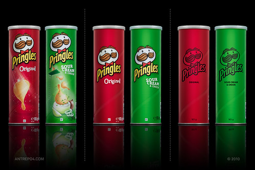
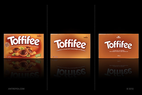
Finally, two examples of how not to use minimalism. And when Pringelsach and at Toffifee it looks bad. Hide the product packaging, in a minimalist version of it does not say anything at all. At first glance you do not know what that is. The space can store more sense to play, but definitely not here. The second version is controversial - the third does not go to me in both cases, regardless of context. Apart from the fact that, as is the mustached debilny the chips.
0 comments:
Post a Comment